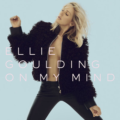
The album was announced along with the single and some limited edition release options also, all with their cover artworks. But now, with a month left before release date, the artwork has been tweaked slightly to use a serif typeface, rather than the orignal sans serif. This may seem like a non-event to some, but actually for such a stripped down cover the change to the text actually has a strong visual effect. Let's have a look below:
The "new" version of the cover (this is the standard edition of the album):
And here is the "original" version (using the same typeface as the 'Halcyon' cover art):
Below is a comparison of the two logos:
Here is the new cover for the deluxe edition of the album, with the new typeface also:
Hmm... to me it seems an odd turn of events. This next release is highly anticipated for Ellie, with some asking if she can take it up a level and maintain the standard of "pop star" that she has cultivated? With this anticipation and level of popularity, I'm sure she has major backing by a record label. It seems odd to me that artwork would be approved, signed off and sent out publicly (across all platforms of her social media, website, official store etc), to then be tweaked and changed. It comes across as sloppy to me and doesn't bode well for the handling of the album roll out. Especially as now there are inconsistencies across her website with some pages still using the old logo and some pages featuring the updated one.
Here is the single artwork for 'On My Mind', featuring the sans serif typeface also, another level of inconsistency now that the main font used for the rest of the album era will be the serif type:
This leaves me wondering: why the change and why now, at this late stage of the album release? Was it to step her away from the 'Halcyon' visual, the still pop but slightly more experimental sounding last album? Was it to embrace the wave of serif fonts being seen used more and more recently - to reflect the potential change in fashion of graphic design?
Hmm... let's see how this one rolls out...and while we wait, check out the limited edition vinyl and boxset versions the album will be released in, featuring art cards and a black & white version of the album cover:
Positive note though, I'm loving the pastelly colour palette and images being used - so there's that :)


No comments:
Post a Comment